The art & practice of typography : a manual of American printing, including a brief history up to the twentieth century, with reproductions of the work of early masters of the craft, and a practical discussion and an extensive demonstration of the modern use of type-faces and methods of arrangement (1917)
Gress, Edmund G. (Edmund Geiger), 1872-1934 · New York : Oswald Pub. Co. · leaf 104
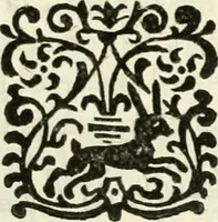
O ^m o O id ¥¥¥ iii ¥¥ … O €(J» «^ EXAMPLE 36 EXAMPLE 37 tone are selected and a border unit adopted that reflectsthe spot of white in tlie ornament. (Example 35.) Clul-tenham capitals maintain the tone scheme. In this case, as in others, the type-face is a trifle stronger in tone thanornament and border. This is well.…
Printing · Graphic design (Typography) · Advertising layout and typography
Internet Archive · Smithsonian Libraries · Public Domain Mark 1.0. Free to use for anything.