The art & practice of typography : a manual of American printing, including a brief history up to the twentieth century, with reproductions of the work of early masters of the craft, and a practical discussion and an extensive demonstration of the modern use of type-faces and methods of arrangement (1917)
Gress, Edmund G. (Edmund Geiger), 1872-1934 · New York : Oswald Pub. Co. · leaf 114
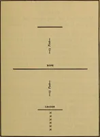
PROPORTION, BALANCE AND SPACING 55 … In EXAMPLE 56which horizontal lines predominate MISFIT It is not always possible to follow out in every detailthe requirements of proportion. Arcliitects must sacri-fice much in the interests of utility and in deference tothe wishes of their clients. Printers must do likewise, butas a rule they…
Printing · Graphic design (Typography) · Advertising layout and typography
Internet Archive · Smithsonian Libraries · Public Domain Mark 1.0. Free to use for anything.