The art & practice of typography : a manual of American printing, including a brief history up to the twentieth century, with reproductions of the work of early masters of the craft, and a practical discussion and an extensive demonstration of the modern use of type-faces and methods of arrangement (1917)
Gress, Edmund G. (Edmund Geiger), 1872-1934 · New York : Oswald Pub. Co. · leaf 125
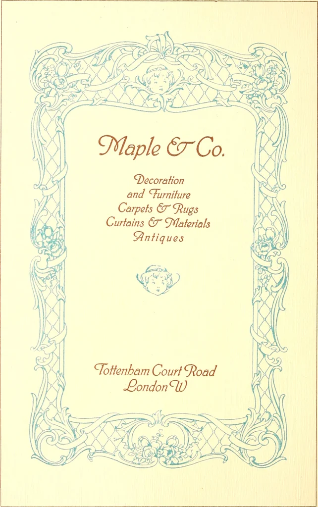
wn in tlie formation of the Romanand Gothic alphabets. Theletters of theRomanalphabet, dignified in their straight strokes andsymmetrical in their rounded lines, suggestfeatures of Roman architecture (Example 106 ;also see Examjjle 43 of a previous article).In the interesting picturesqueness of… … EXAMPLE 98 Dainty, elatorate rococo ornament, as applied to a pro-gram title-page. Compare witt tte ckair. Exam pie 97 ORNAMENTATION 61
Printing · Graphic design (Typography) · Advertising layout and typography
Internet Archive · Smithsonian Libraries · Public Domain Mark 1.0. Free to use for anything.