The art & practice of typography : a manual of American printing, including a brief history up to the twentieth century, with reproductions of the work of early masters of the craft, and a practical discussion and an extensive demonstration of the modern use of type-faces and methods of arrangement (1917)
Gress, Edmund G. (Edmund Geiger), 1872-1934 · New York : Oswald Pub. Co. · leaf 169
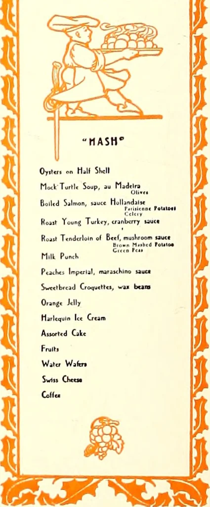
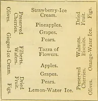
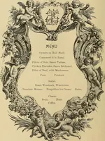
house have bills of fare. Thepolite title is now menu,pronounced men-yu or meh-1100. Some writers claim theword came to us fromManu, a mythical sagesaid to have sprung from thegod Brahma. Yet the dic-tionary would seem to indi-cate that the word is French,meaning small, and was de-rived from the… … EXAMPLE 213Humorous treatment of titlesand odd menu arrangement.Design by tbe Griff itb-Stil-lings Press, Boston, Mass. ANNUAL MEAL ^ TALKCITY EDITORS LEAGUE
Printing · Graphic design (Typography) · Advertising layout and typography
Internet Archive · Smithsonian Libraries · Public Domain Mark 1.0. Free to use for anything.