are allvery attractively de-signed and well execut-ed, while the color com-binations are especiallypleasing. However, itwould be well to re-strain your evidentliking for the use ofgold bronze for the de-corative parts of yourdesigns, as it tends todraw the attentionaway from the message.A… … A Cover Page by F. H. Dobbin, Peterborougb, Ont. profusion of gold bronze, while in the second theattention is centred on the wording, for the rule-work is subdued by being printed in a tint. Thecolor combination of this second letterhead is thebest of those of the specimens submitted. Chas. G.…
Printing
Internet Archive · University of Toronto Libraries · Public Domain Mark 1.0. Free to use for anything.
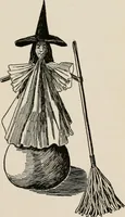
![An illustration from The Child World. [In verse.] ... Illustrated by C. Robinson (1896)](https://img.insideoutlibrary.com/img/200/bl-bl_003344033_0-22-1.webp)