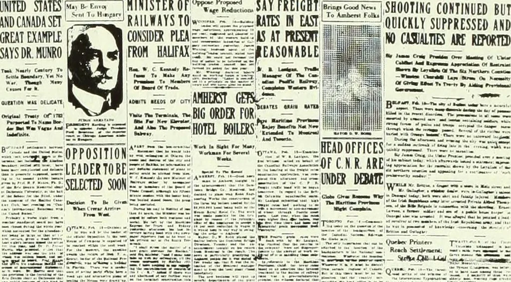
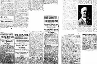
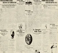
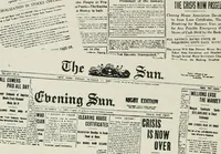
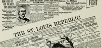
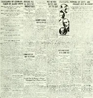
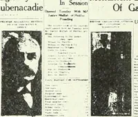
theory supporting this practice is that lowercase lettersare easier to read and are more inviting to the eye than cap-ital letters. The Halifax Herald adopts the pyramid form in placing itsadvertisements. This is good practice. It is noticeable that The Halifax Herald C=^ MANY FUNERALS OF RIOTERS… … nr-™ t.. - srsjtrsn.—, b L.--.T--•:..... .. :-_ ... £K=£=>-r.r =r=.-=rr_-=r i HHi -^£^=T^C ■V-::- Lr£ jjj£g^£j?| In Fba !.:,■■ •■.. —,u... Slrima | RASHES OF WORLDS NEWS | Sfg aaSa?*™8 rr*^r sun: H.~ ^z,-=J--=r ;.-»= 7 c=r^r= S«.B-1F«CR ~\——.■:- Woui Fill. Vkakn ■ tttpnc, 1 .r„„ -I r **= ~ ■ -*:…
Printing
Internet Archive · University of Toronto Libraries · Public Domain Mark 1.0. Free to use for anything.
![An illustration from Artist Obituary Scrapbooks: Volume [2] (1915-29) (1915)](https://img.insideoutlibrary.com/img/200/met-p16028coll4_48865-65-1.webp)