Sargent, Walter, b. 1868 · New York, C. Scribner's Sons · leaf 247
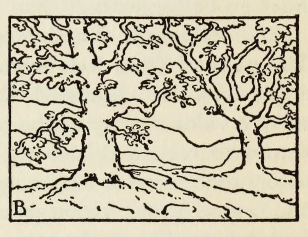
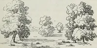
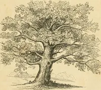
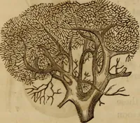
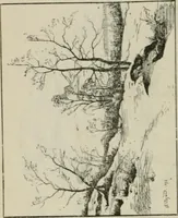
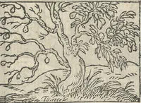
COLOR HARMONIES 219 group of colors. Intense tones and strongly contrasting colors are usually most pleasing in designs of small area, and even there appear richer when there is an interplay of neutrals, as in the case of the opals previously mentioned. An interesting correlation exists between the… … Fig. 30. Particular arrangements of line frequently suggest appropriate color schemes. from that of the other. Have in mind two schemes of sun- set color, one rich and glowing with gorgeous hues, the other cool and quiet. Look for a moment at A and then at B. Does the character of line in each seem…
Color
Internet Archive · Brigham Young University-Idaho, David O. McKay Library · Public domain (published before 1931). Free to use for anything.