De Wild, John H · Minneapolis : Northwest Commercial Bulletin and Hardware Trade · leaf 12
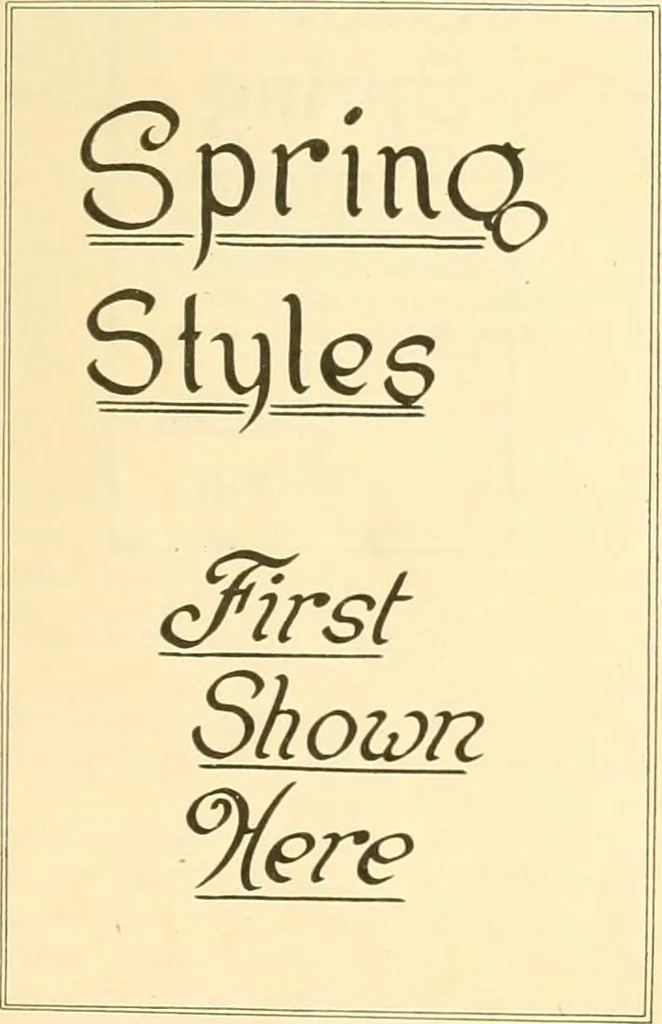
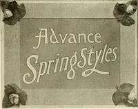
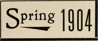
lines in Italic, and is an example of howthey contrast with the other lettering. Thiswould be more so if the words AttractiveNeckwear were drawn with red ink, orother bright color. Figure 5 is an example of emphasizingthe wording in the center, or nearer the … bottom of the card. Wherever Italic is usedit should be borne in mind that contrastor emphasis is the effect sought, and theItalic should be used accordingly. Figure 6 shows the Italic used for theshort lines which in printing and show cardwork are called catch lines. By drawing your catch lines in…