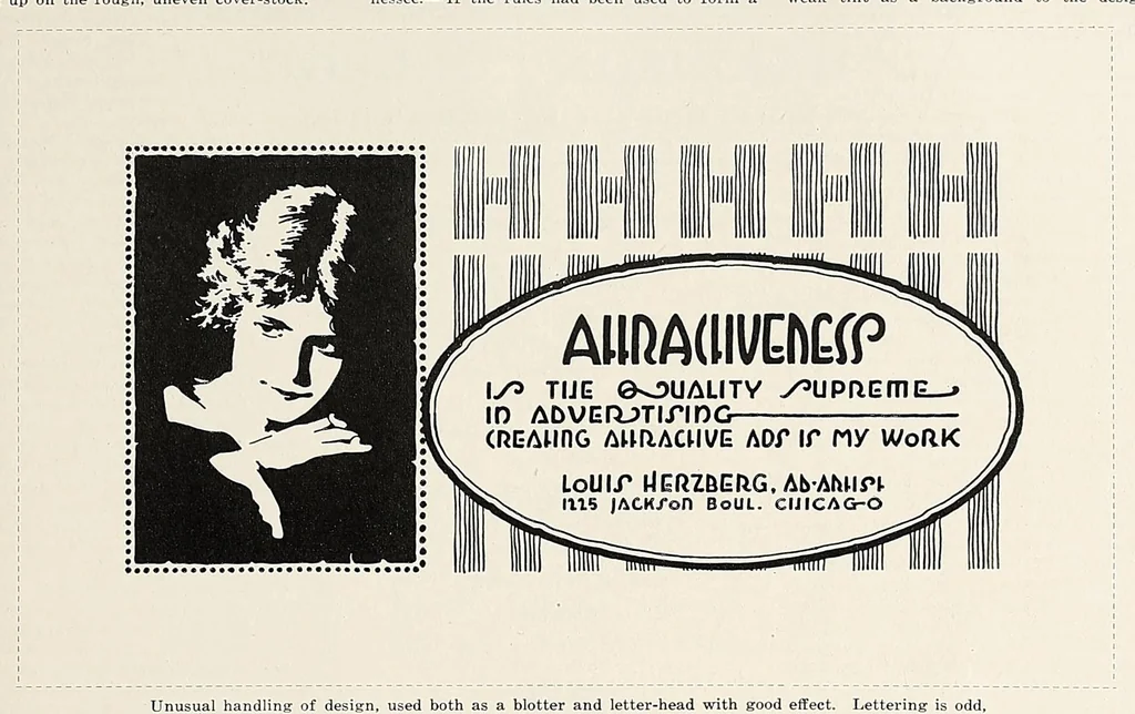
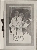
em, Massachusetts. group at the bottom, the design is overbalanced, by the local union is simple, neat and attrac¬ — Your business card in which the word that is, too heavy at the bottom. tive. The inside pages are not well printed, “ printing ” is printed from large type in a Foster & Parkes… … Unusual handling of design, used both as a blotter and letter-head with good effect. Lettering is odd, but not very readable. By Louis Herzberg, Chicago. complete border around the Easter card for especially effective and quite novel. The other A. E. Sears, San Marcus, Texas.— Your own Hall,…
Printing -- Periodicals · Printing -- United States -- Periodicals · Bookbinding -- Periodicals · Bookbinding -- United States -- Periodicals · Graphic arts -- United States -- Periodicals
Internet Archive · Smithsonian Libraries · Public domain (published before 1931). Free to use for anything.