Printing : a practical treatise on the art of typography as applied more particularly to the printing of books (1904)
Jacobi, Charles Thomas · London : G. Bell & Sons · leaf 283
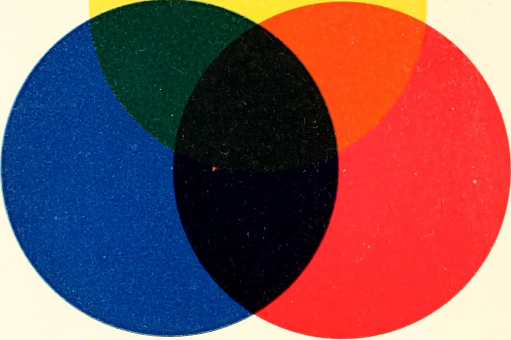
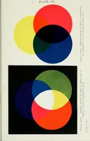
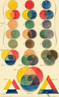
ther is superimposed on it. If, however,the first or second printing is allowed to stand too long, adifficulty of another kind is created, and the precise psycho-logical moment is best realized by actual experience of apractical nature, rather than by any rule of thumb. Paper forms another… … FlG. 137. TRICHROMATIC COLOUR CHART. THREE-COLOUR PRINTING 253 This, of course, is a point to be striven for; otherwise, theresults will be disappointing by the completed picture turn-ing out flat and lifeless. The best shades of inks for the purpose are (a) primroseyellow, (b) crimson red, (c)…