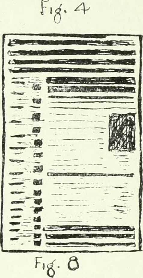
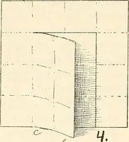
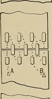
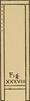
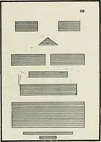
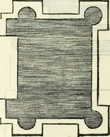
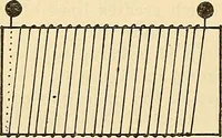
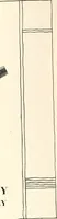
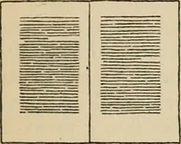
Figures 3 and 4-Figure 4 not only has more depth thanFigure 3, but is more pleasing to the eye; it also gives betteropportunity for display and balance, for the heavier tones arelogically at the beginning and at the end of both pages, theheavier at the top. Figure 7—Notice how the three heavy lines…
Printing
Internet Archive · University of Toronto Libraries · Public Domain Mark 1.0. Free to use for anything.