Fairchild's rapid letterer and show-card maker, commercial alphabet construction with brush or pen (1910)
Hackes, Sidney, [from old catalog] comp · New York, Chicago, Fairchild company · leaf 20
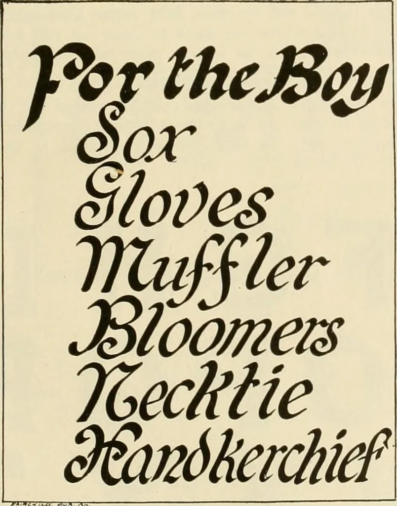
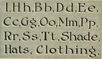
g for this card is black on white.A more effective style is to run a double red rule under the topline and a single rule under each word. A richer effect is tomake all the initials in red and run a gold rule under the topline and a gold rule only under the lettering after each initial.All the… … No. 2.utility for the season as well as practice and we must make It.I would use red for the F and D on the top line and black forall of the rest of the lettering on the entire card and then run nxv collxvs ^xrfers unScrwexr suspenders .I^IRCHUD pue c. No. 3. thin rules of red or gold under each…
Lettering · Advertising cards
Internet Archive · Library of Congress · Public Domain Mark 1.0. Free to use for anything.