Printing : a practical treatise on the art of typography as applied more particularly to the printing of books (1904)
Jacobi, Charles Thomas · London : G. Bell & Sons · leaf 68
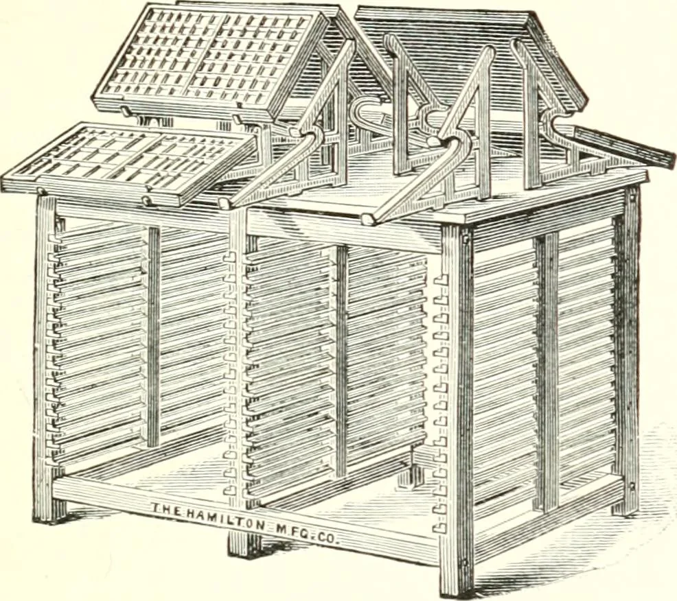
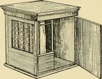
the partitionsfirmly to the bottom of the ease. TYPE-CASES 41 There are two eases used for ordinary bookwork, calledupper and lower case, which contain the capitals and thesmaller letters respectively. Though Ens-lish cases are alwavs made with the same mini-ber of boxes or divisions, the lay, of… … FlG. 17. NEW YORK QUADRUPLE FRAME. box in the lower case, and the other vowels and consonants most frequently used are placed in the next size of division.These boxes are situated according to the demand for thedifferent letters in setting-up ordinary works. For instance,the compositor stands at…