The typography of advertisements that pay : how to choose and combine type faces, engravings and all the other mechanical elements of modern advertisement construction (1917)
Farrar, Gilbert Powderly, 1886- · New York ; London : D. Appleton and company · leaf 111
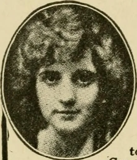
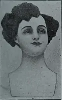
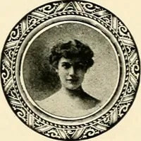
extra strength. The Foster Series is a good one to use insteadof Gothic because it is not so blunt and sharp andyet it is equally as strong. Three lines of condensed Foster are shown inthe Carmen Complexion Powder advertise-ment. John Hancock is another good substitute forGothic. The watch… … For a Complexion Like Hers simply do what Louise Huffand other famous stars do,whose complexions are subjectto particular notice—use CarmenComplexion Powder. Then you willhave a complexion of peach-and-cream charm. Blendsperfectly with the tones of the skm—and it adheres.^ Does not rub or blow off.…
Advertising · Typography · Typesetting
Internet Archive · Duke University Libraries · Public Domain Mark 1.0. Free to use for anything.