The typography of advertisements that pay : how to choose and combine type faces, engravings and all the other mechanical elements of modern advertisement construction (1917)
Farrar, Gilbert Powderly, 1886- · New York ; London : D. Appleton and company · leaf 219
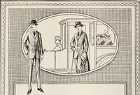
full-pageadvertisement—four times the size of space usedwithout increasing the thickness of the border.But for a quarter-page it is too dominant. It istoo much in evidence. The border of an advertisement should neverbe so strong as to weaken the headline or picture.A border is ^millinery^ at… … ^r^Mions^
Advertising · Typography · Typesetting
Internet Archive · Duke University Libraries · Public Domain Mark 1.0. Free to use for anything.