The typography of advertisements that pay : how to choose and combine type faces, engravings and all the other mechanical elements of modern advertisement construction (1917)
Farrar, Gilbert Powderly, 1886- · New York ; London : D. Appleton and company · leaf 269
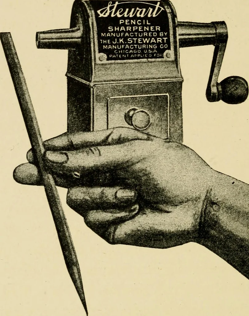
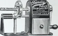
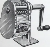
ional style is usually effective and producesa more pleasing and wholesome appearance, I amalso of the opinion that the majority of adver-tisements must be unusual and striking in make-up to get attention. Practically all of the plain Passive Educationaladvertisements occupy half or full pages and,… … Get this point! You cant break the pencilpoint in a Stewart sharpener. Its the first of its kind—an effi-cient, durable, needed tool. See itin your dealers window. Test itin your office — home — school. Made by J. K. Stewart ManufacturingCompany, of Chicago, and sold at aUdealers—or direct from…
Advertising · Typography · Typesetting
Internet Archive · Duke University Libraries · Public Domain Mark 1.0. Free to use for anything.